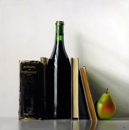

20″ x 20″ — Oil/Canvas — 2009
• SOLD
The Manual of Psychology belonged to a law student in 1905. My mother-in-law’s mother-in-law was the housekeeper for the gentleman lawyer decades after his schooling. After he passed away, she was given all his books as they were something she admired.
I have the book sitting in front of me. As I casually flipped it open, it landed on a page discussing spacial perception. One hundred and four years ago the student scrawled the word chiaroscuro beside the phrase “The play of light and shade…”. I find it curious that I’d flip open an ancient psychology text and by chance fall on a page explaining visual concepts used by artists — the use of light and shadow to create a sense of depth.
Is this book trying to tell me something?
I love the echo of colours in the different objects, beautiful work. And the discovery in the psychology book was possibly a student who really wanted to do art:)
Hi! Christopher Stott,
The Manual of Psychology is a very “beautiful” painting.
Very realistic,nice use of light and shade, and
nice use of primary colours on the pear.
(That is if the pear is green and red…)
Christopher Stott said,”Is this book trying to tell me something?”Hmmm…That is a very interesting question?!?
and a very interesting account of how your mother-in-law’s mother-in-law acquired these books.
Thanks, for sharing!
DeeDee ;-D
You have such an amazing gift. I am so in awe of your talent and paintings. This is another great one. Just curious, how long does it take you to paint one like this?
Hello, thanks for the comments!
It takes around seven days to complete a piece this size. Not consecutive days as I let layers dry.
I love the balance and play of the different shapes in this painting and also the sense of airiness. You have a great talent!
Chiaroscuro … my favourite word 😉
Really beautiful! i love the bold highlight stripe in the bottle. It mimics the verticals of the books. Its interesting to think that without that strong of a highlight the bottle would be essentially lost in the center of the painting. Also i really like the stripey shodows on the wall at the right.
~Victoria Viramontes