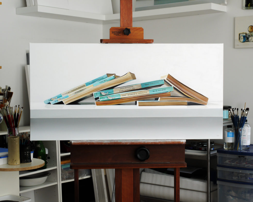
Here’s a glimpse of a recently completed painting – a Corona No.3 typewriter. I’ve used this in the past but it needed a bit more of a grand composition so I added some pencils and books.
Corona No.3 – On the Easel
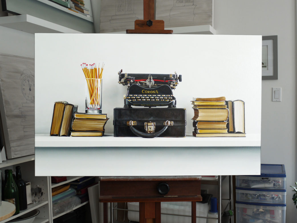
Here’s a glimpse of a recently completed painting – a Corona No.3 typewriter. I’ve used this in the past but it needed a bit more of a grand composition so I added some pencils and books.
I just finished this commission and now I can start focussing on new paintings for my early spring 2019 solo exhibition in New York City at the George Billis Gallery.
This past week I spent some time with some do-overs.
These two paintings are from a few years ago and although they don’t look too unusual for my work, they did before I repainted the backgrounds.
Before these pictures were taken, the backgrounds were what I call explosion blue. They were a vibrant, unnatural, unfamiliar, chemical blue.
They were complete and even hung in a gallery for some time, but I was happy to get them back to correct them. I was pleased with the balance and geometry of the compositions, but the blue was so peculiar to my eyes that I had a hard time looking at the paintings.
I removed the varnish and added some layers of a much more subtle and neutral tone — a white/grey with only the most subtle, barely perceptible hint of blue. Immediately it felt as though my own personality returned to the paintings.
I did the vibrant blue backgrounds on the suggestion from a friend who was giving some opinion on changes they thought would add some “pop” to my work. In a moment of weakness and confusion, I took their advice. It was as though my own signature was removed from my work.
The opportunity for the do-over has been very therapeutic.
Imagine if life were like a painting. Imagine if you could literally get a moment or an event back, remove the varnish and make your corrections.
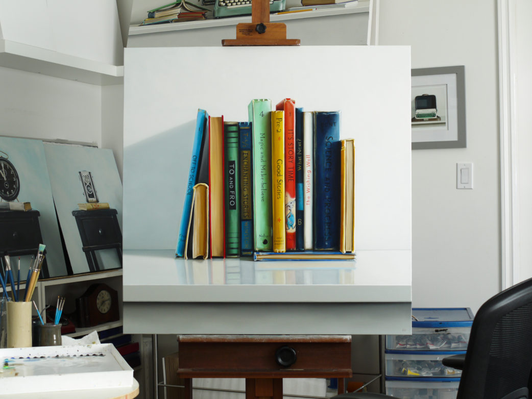
I’m calling this one done. Finding the point of completion is always satisfying on a painting. This one is going to hang in my house for some time while I move on to the next stack of books to paint.
This painting is available as a 12 x 12 inch print. See it in my print shop → here.
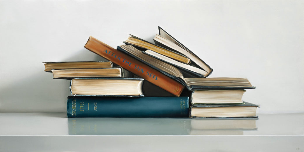
I made a smaller version of this painting last year and thought that it deserved another composition and a larger canvas.
After The Sun Sets II is at the George Billis Gallery in New York City.
An 18 x 36 inch composition of wonderfully aged Pelican Books – see the painting closer here.
These books cover a broad range of subjects – everything from art, architecture, history, philosophy, etc. Something for everyone. And even though these books come from the past, they’re still relevant.
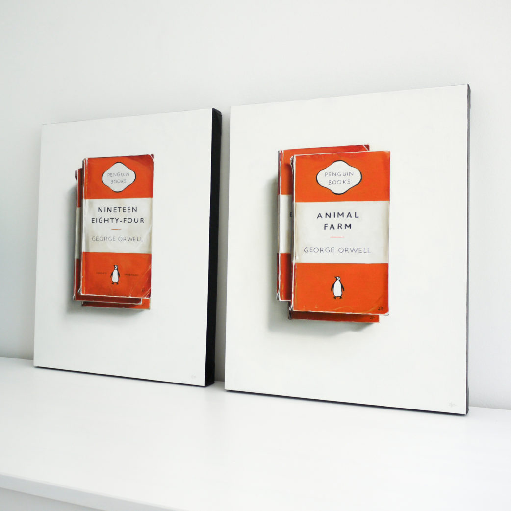
These two are on the way to the George Billis Gallery in New York. Nineteen Eighty-Four and Animal Farm by George Orwell.
If you have time, please read this article about my work from Wall Street International Magazine. You’ll find a very good summation of the intentions of my paintings.
These two paintings are part of my current exhibition in Los Angeles at the George Billis Gallery.
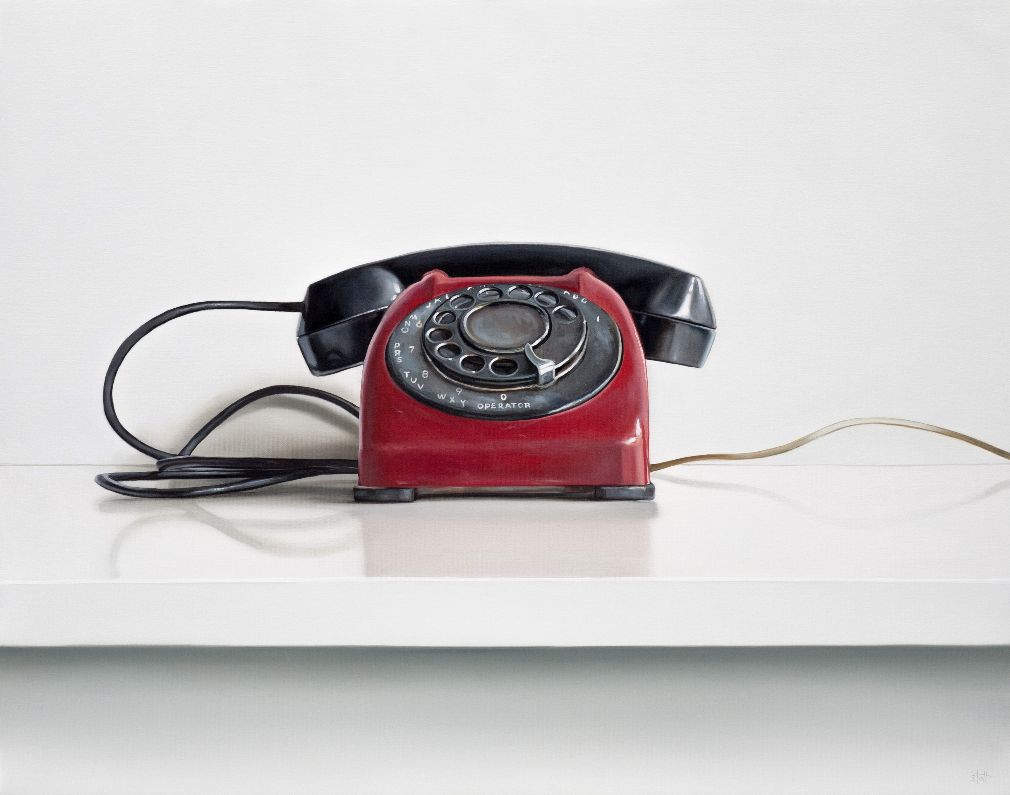
They are used as representations for communication – a theme I have focused on for several years. Talking and listening; the literal functions of these as objects. Admired also for their iconic designs and vibrant color.
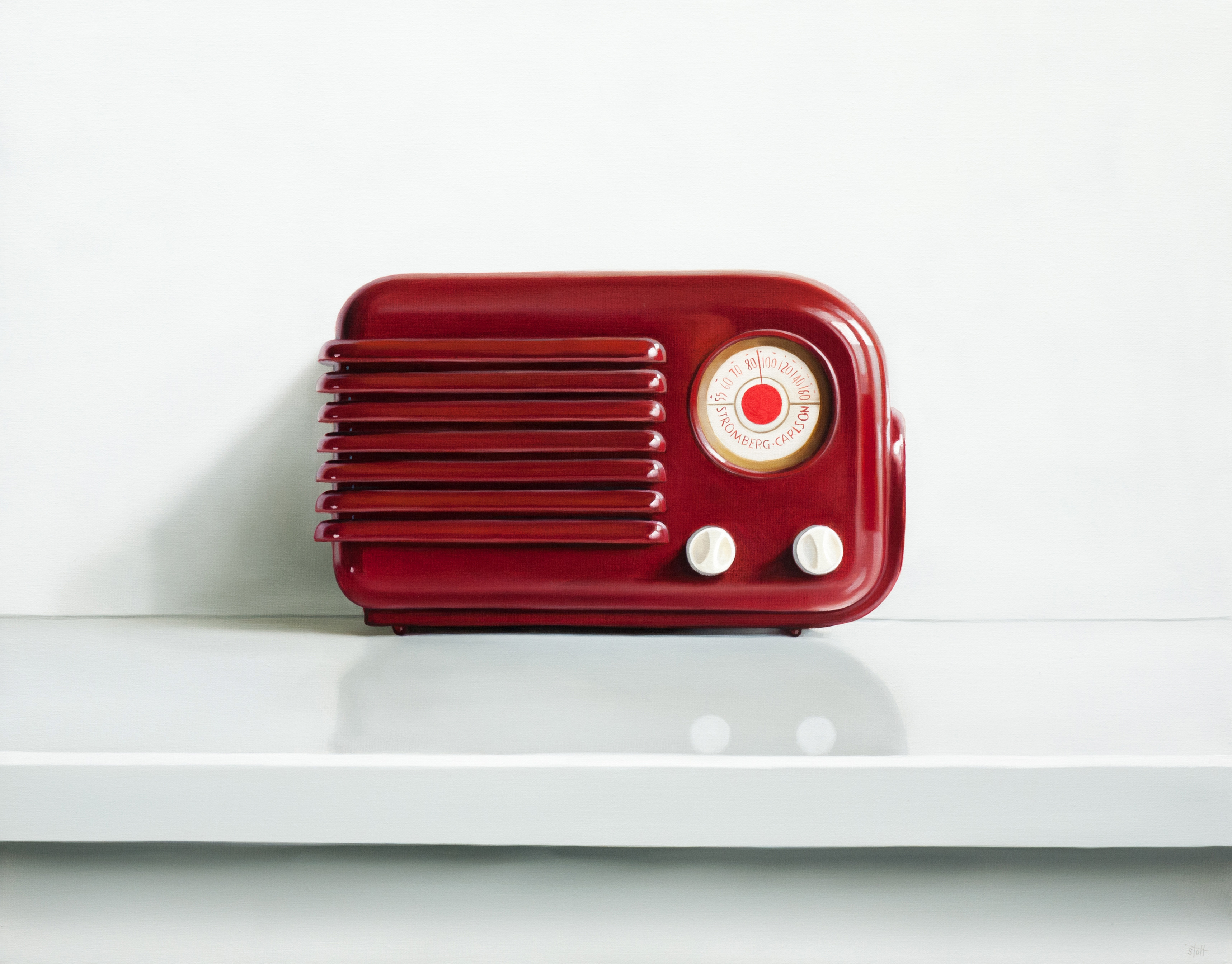
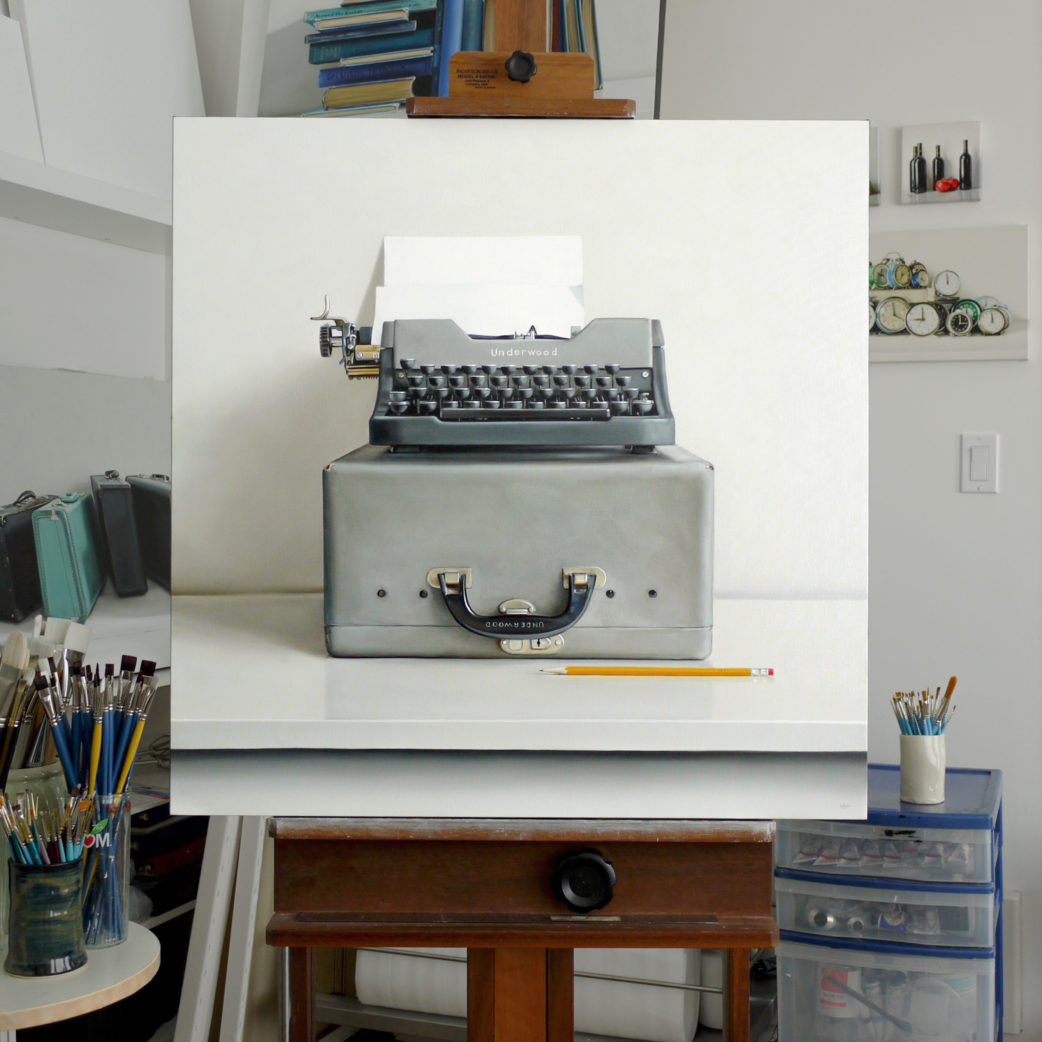
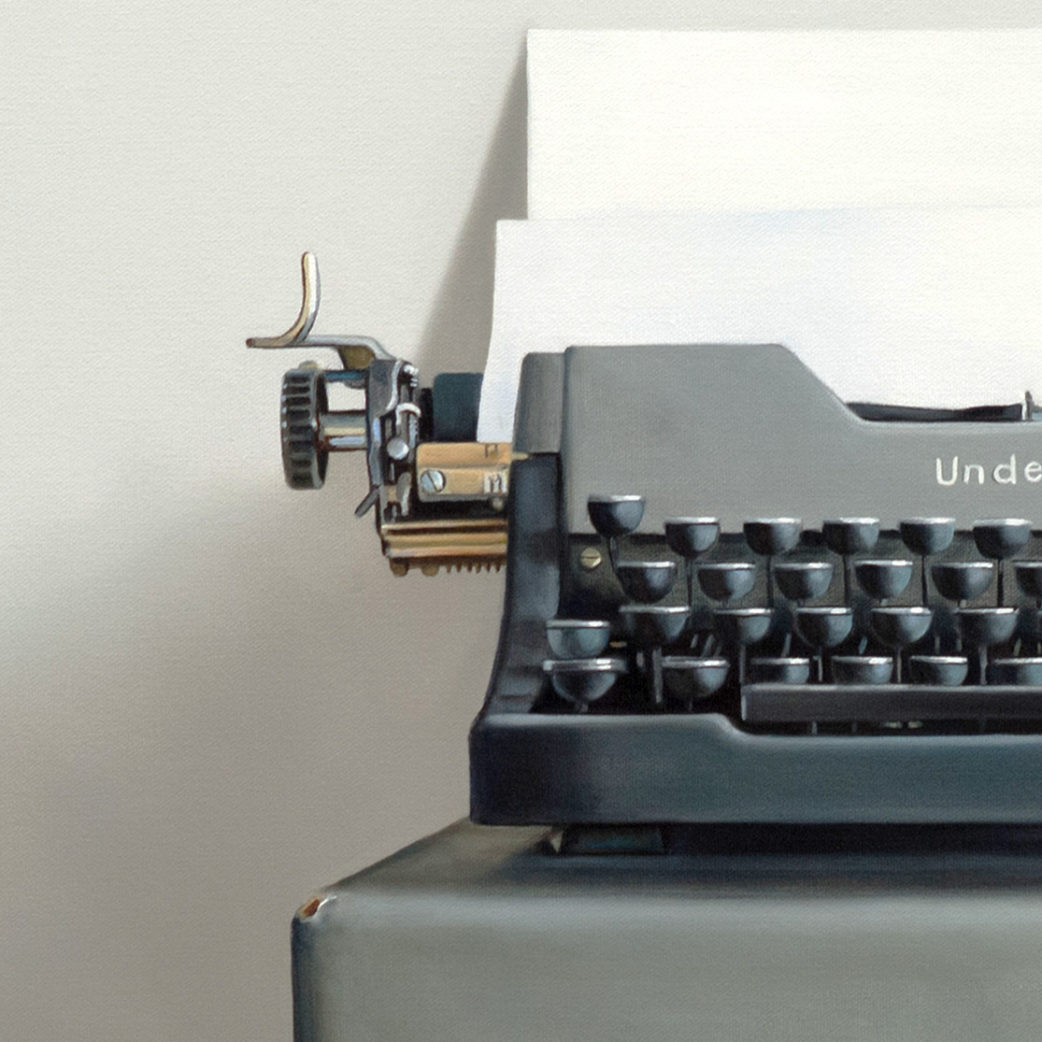
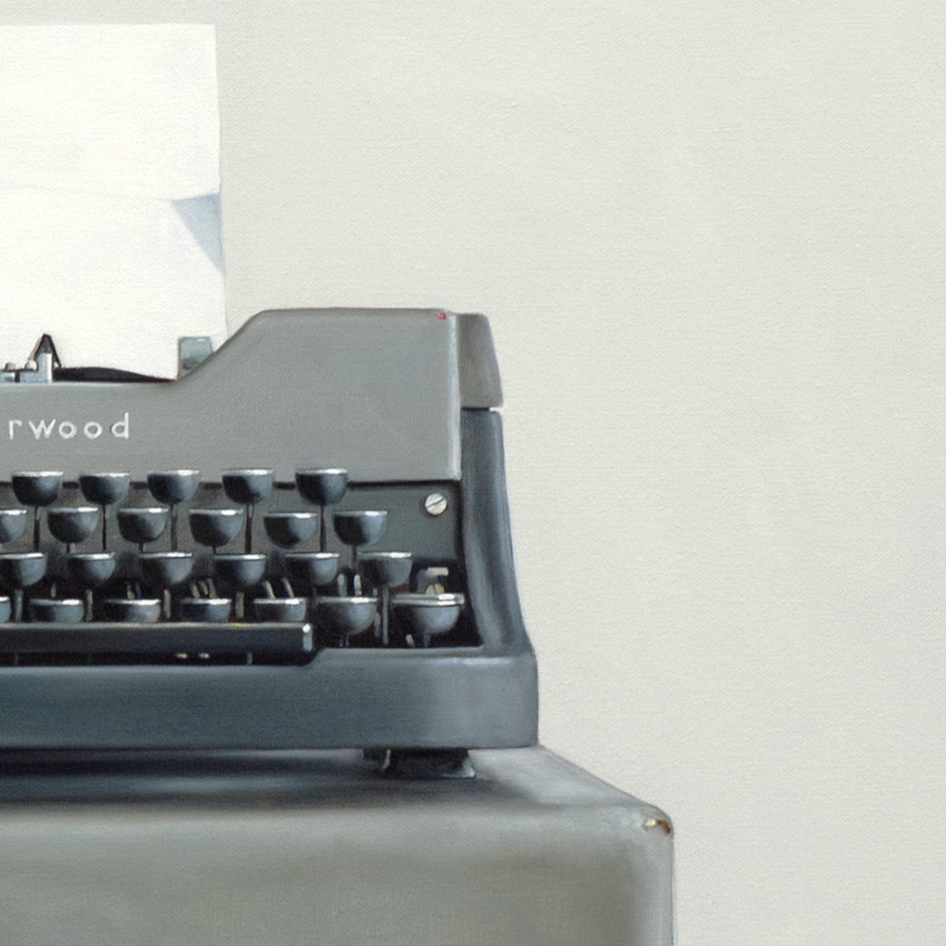
Typewriters seem to embody ambition. They represent the tools to document thoughts, ideas and stories – you literally hammer your words on to paper.
They’re familiar to us, but distant enough to be obsolete. As with all the man made objects I use as subjects the compositions are simple and straight forward. But they become more complicated with the repetition of the keys and the mechanics of the machine.
I’ve painted many typewriters and without fail, every time I start working on the keys, I think “what did I get myself in to?”
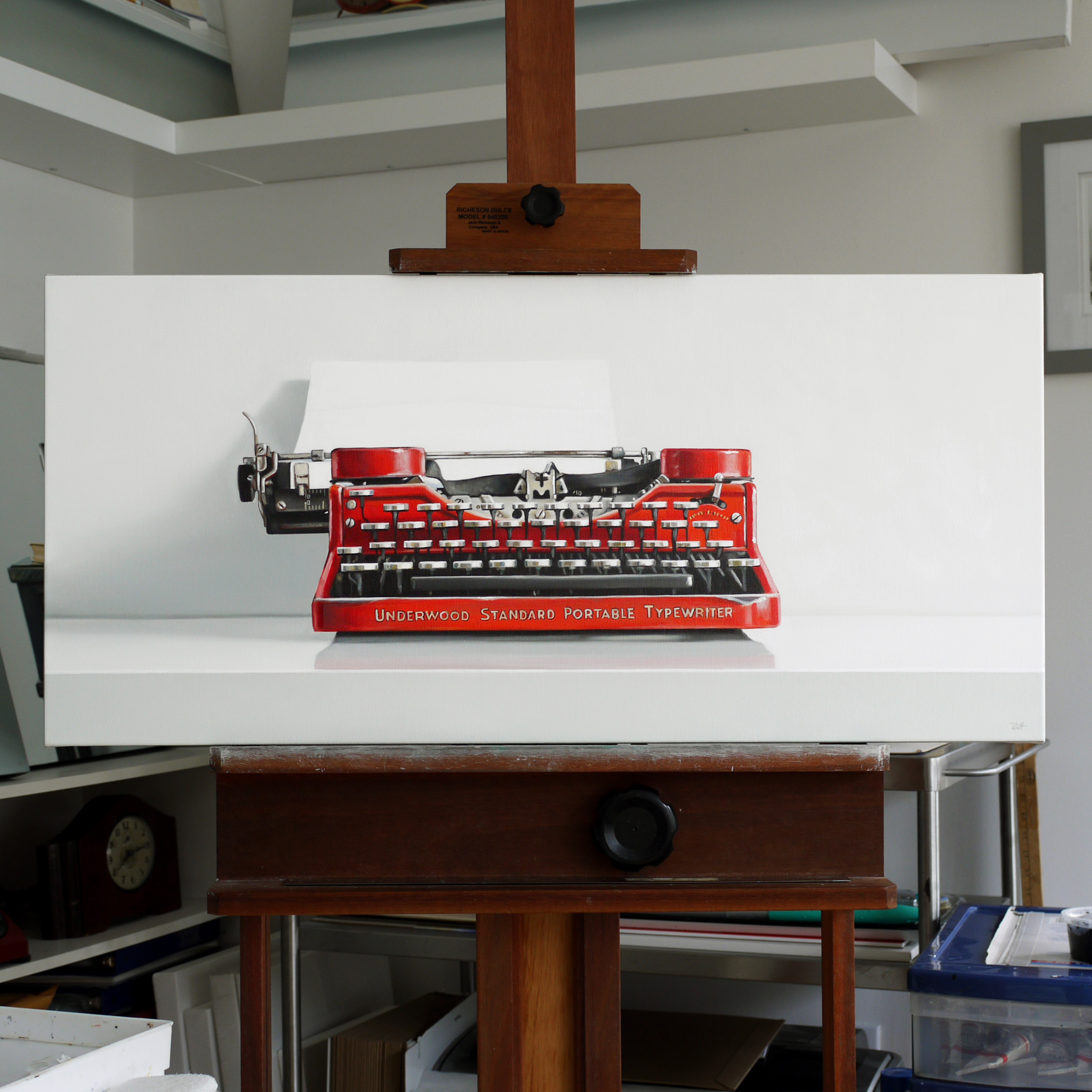
Above: Underwood Leader
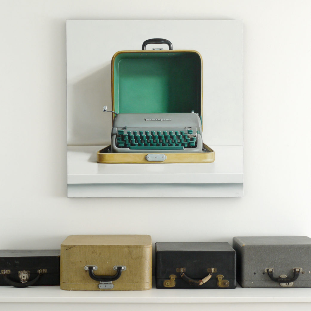
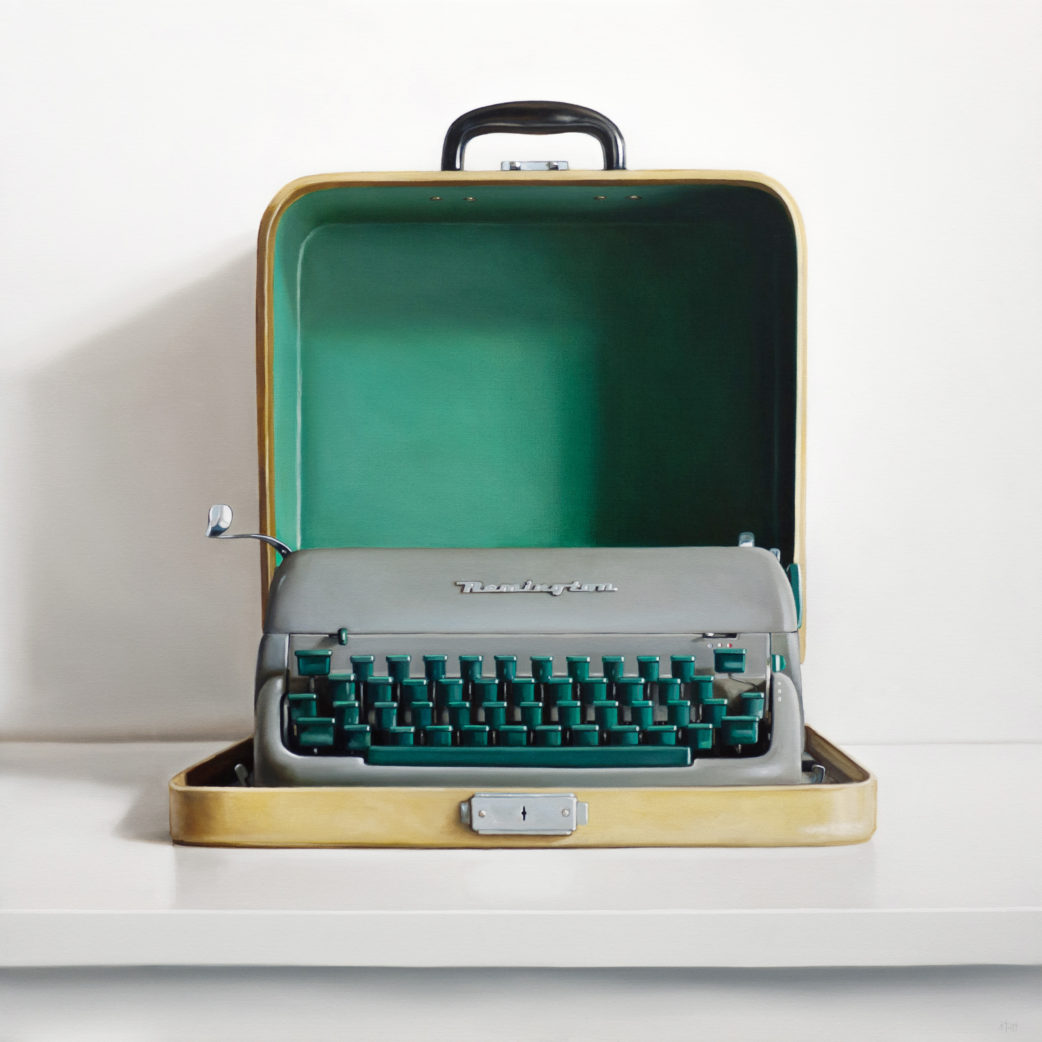
Below: Remington Quiet-Riter II