Tagged clock

Recent Clock Paintings

These two pieces will be part of my upcoming exhibition in Los Angeles at the Billis Williams Gallery, opening on February 24th.

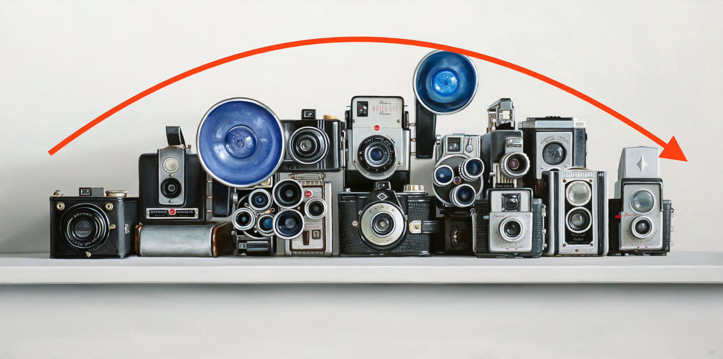
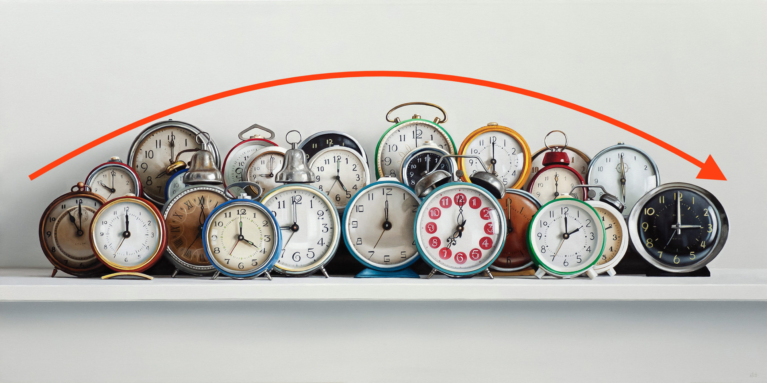
My last exhibition in New York involved many large paintings, so this time around, I decided to work on a slightly smaller group of canvases.

Three Clocks & Pelican Classics / 18 x 36 inches / oil on canvas / 2024 / on the easel

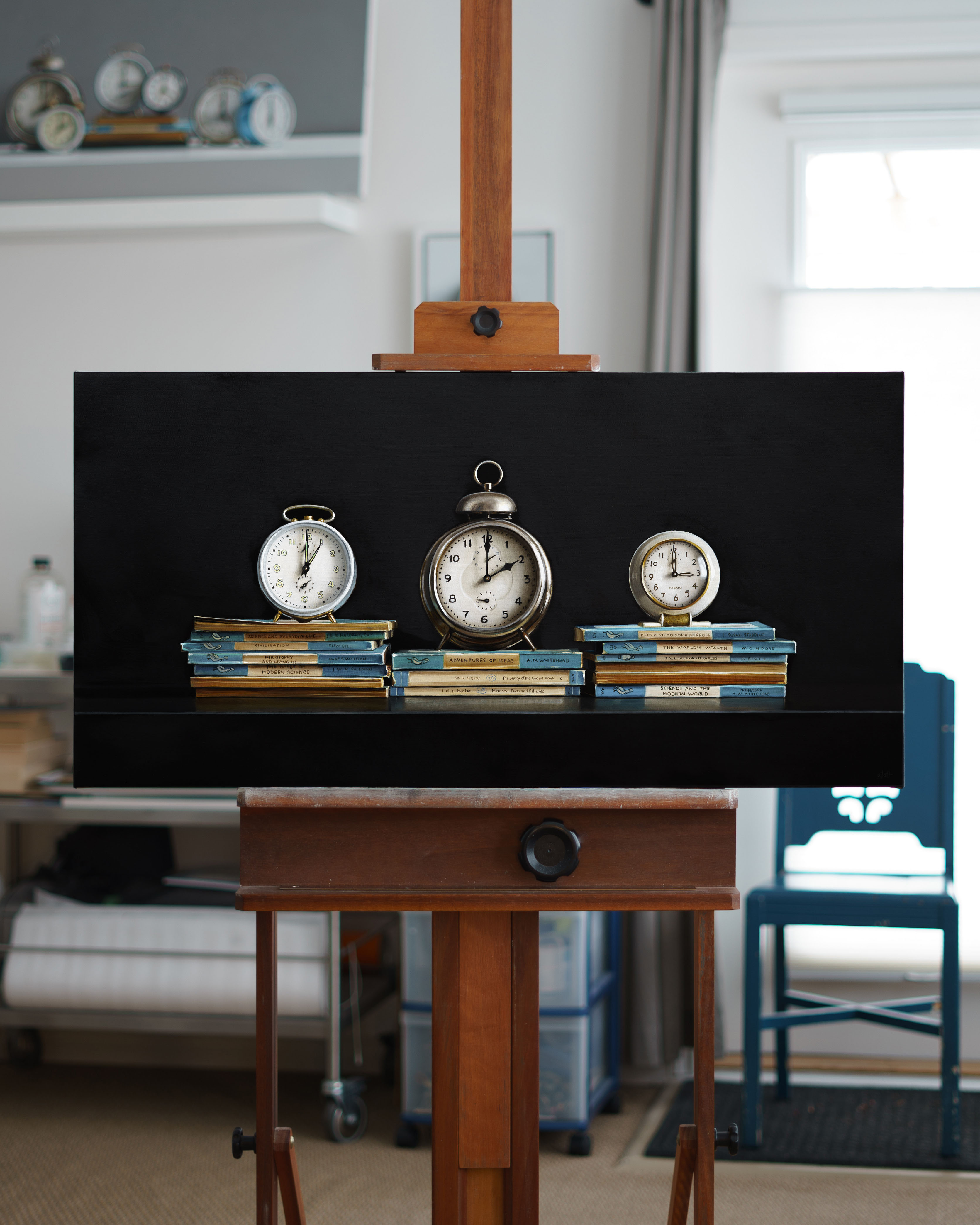
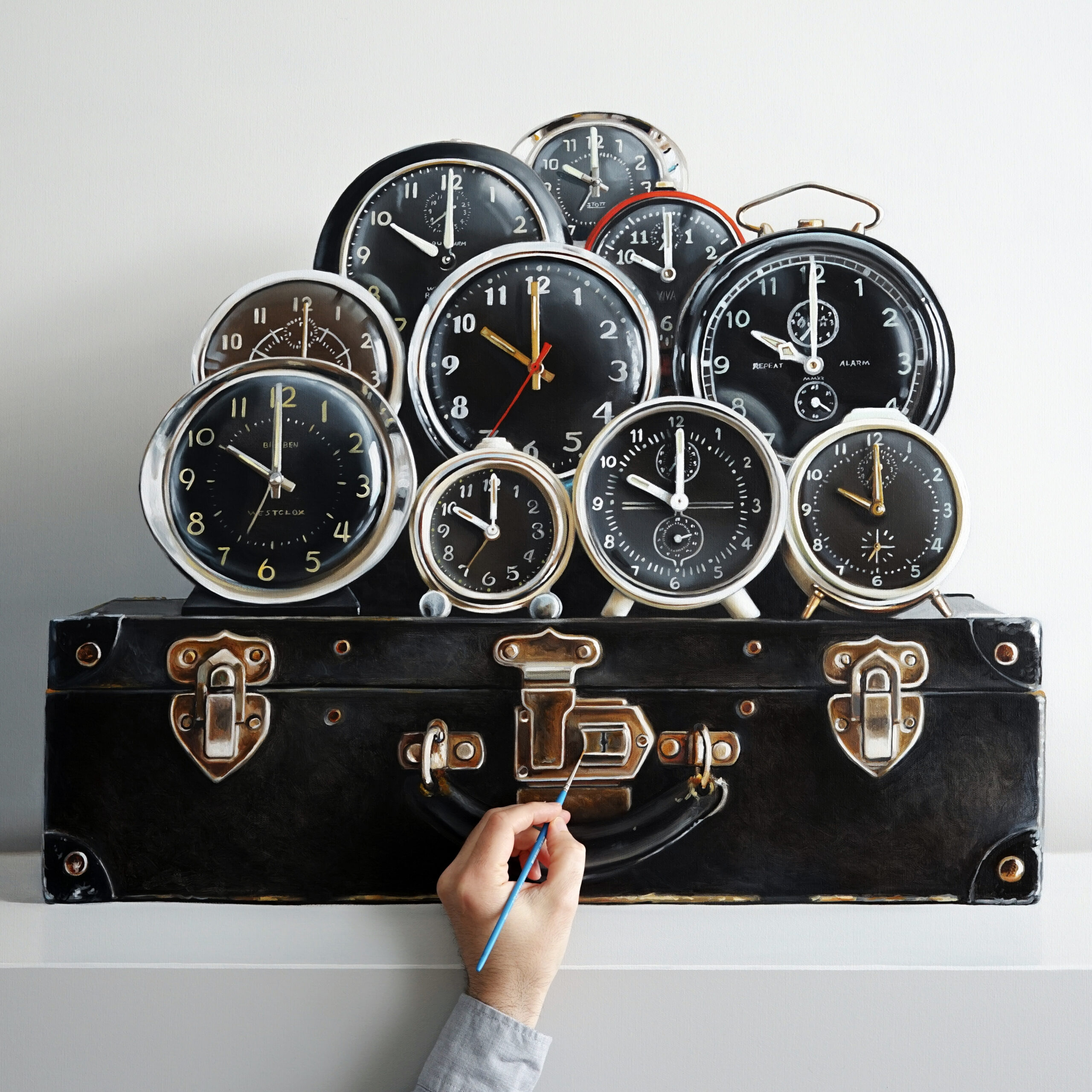
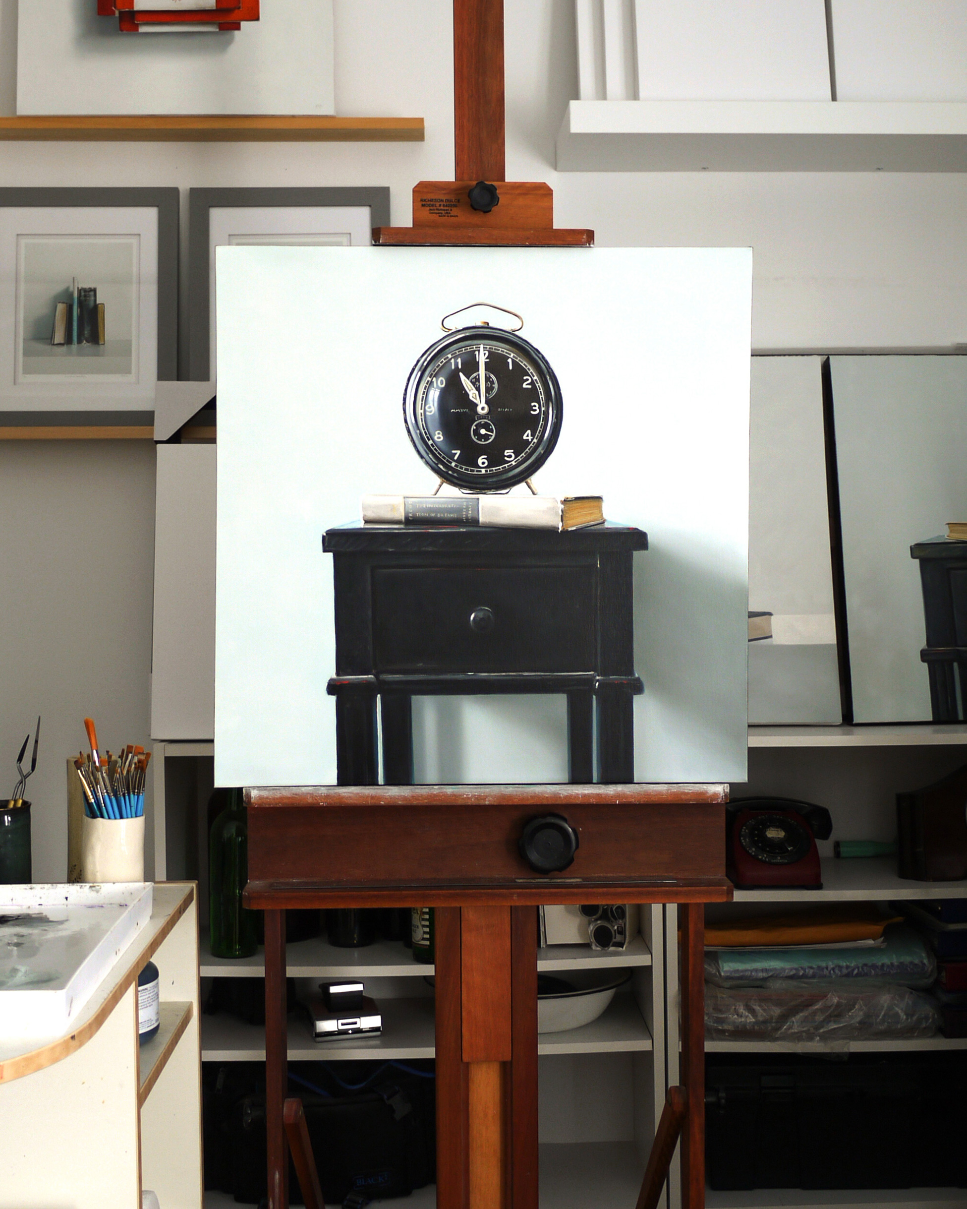
Also, the black. Let’s talk about it. Years and years ago, I regularly set my work on deep black ground. I gradually phased that out and worked exclusively on white — or near-white grounds. In the past few years, I have done smaller paintings in black; it revealed my subject in a fresh and new way. So, above is the first of a slightly larger painting of what will become a new direction for my work.

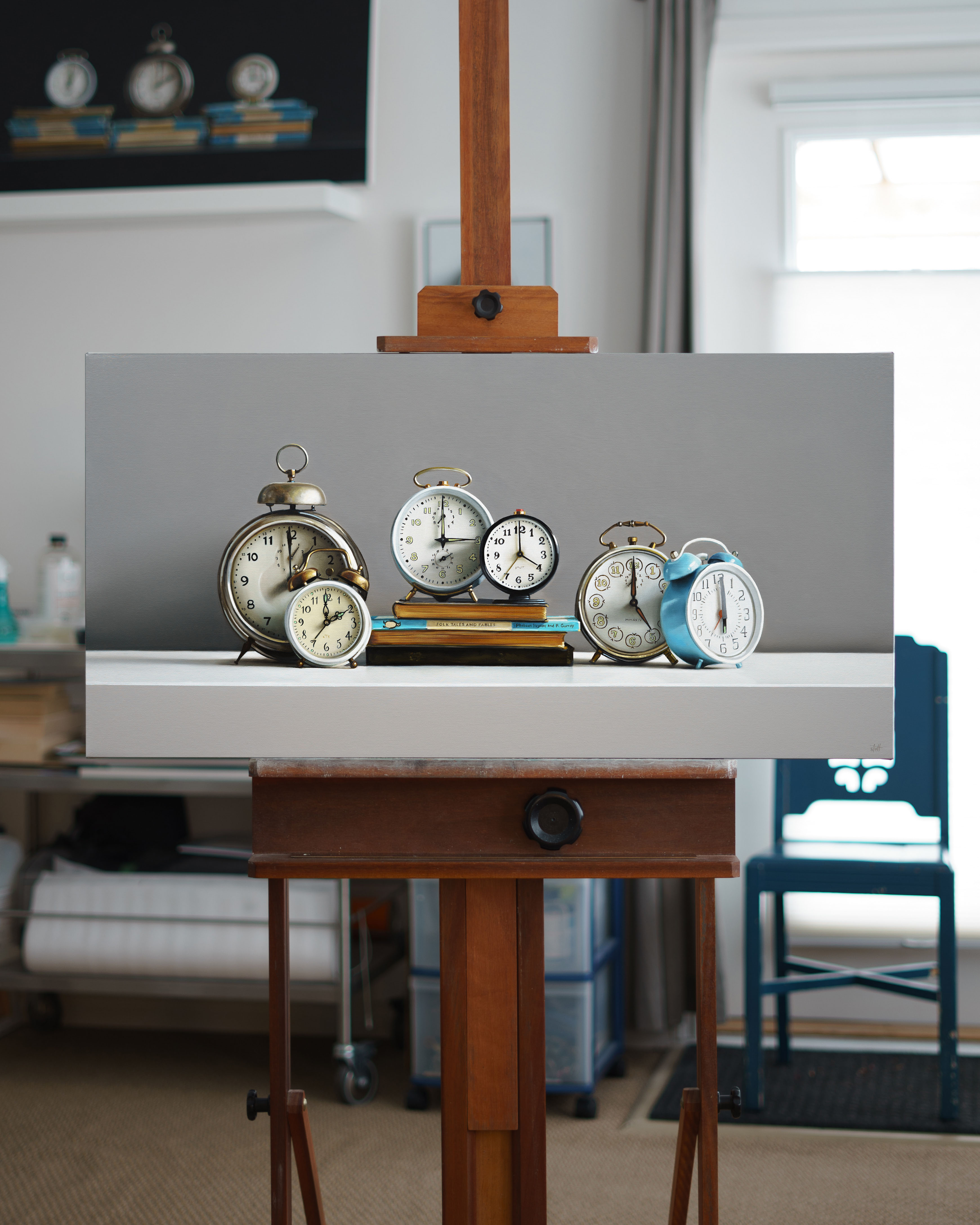
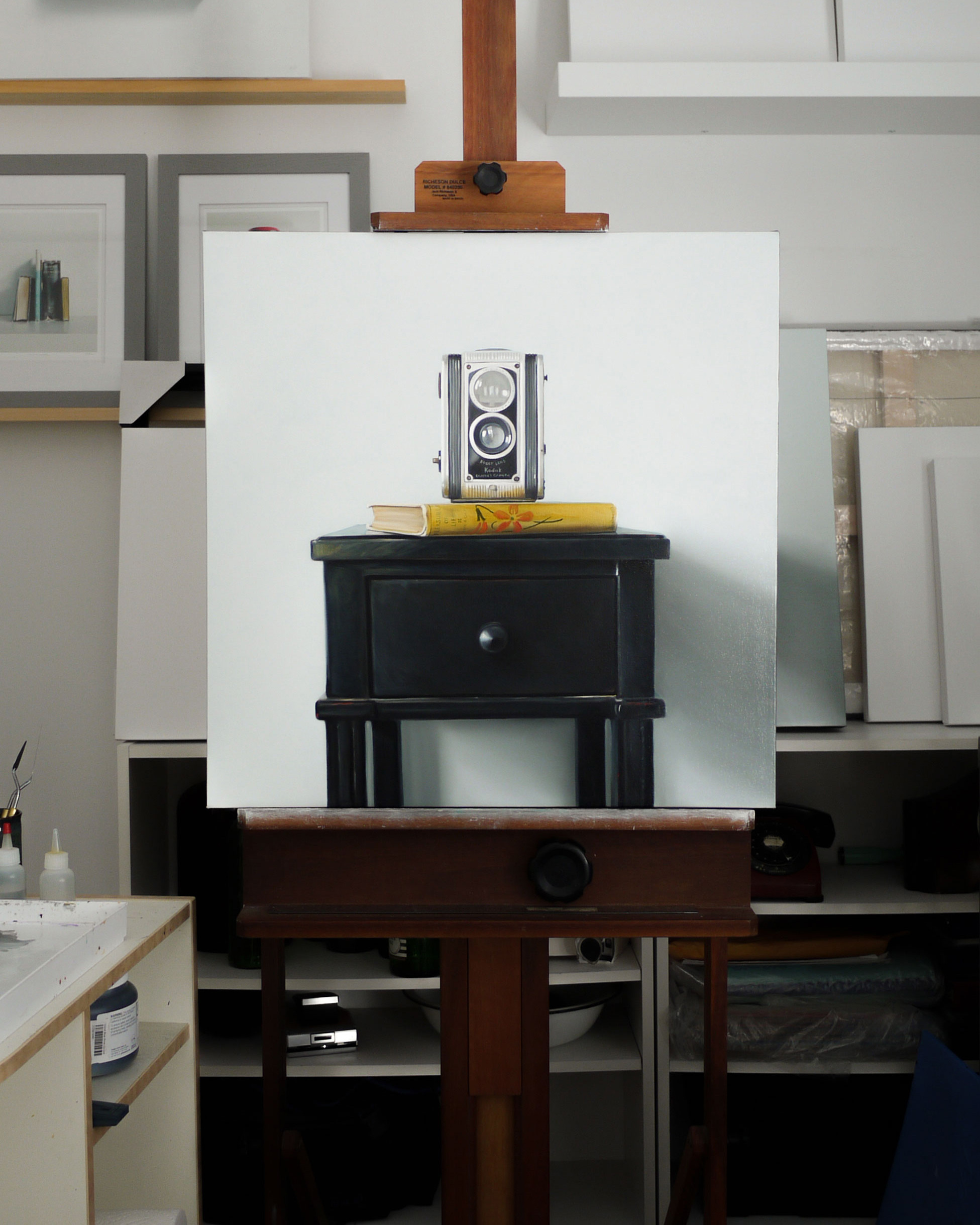
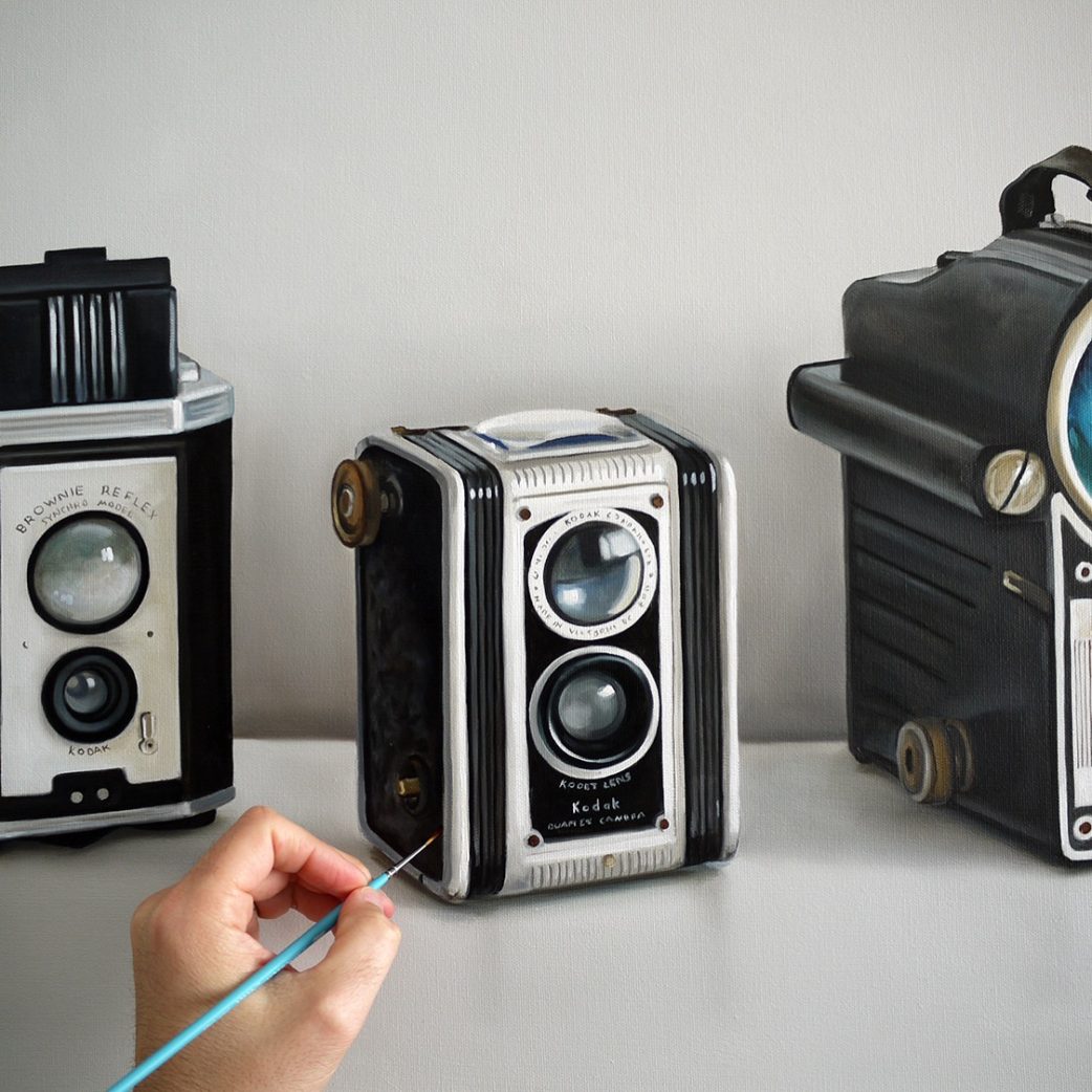
Below, we have a neutral grey approach. Another way to make the subjects pop right off of the canvas.

Six Clocks – Folk Tales and Fables / 18 x 36 inches / oil on canvas / 2024 / on the easel

Yin & Yang

This painting is the yin to the yang of the painting I shared yesterday.

It crossed my mind while I was painting these that they were taking a very long time to complete. It didn’t seem to matter.

Along with the white clocks, this piece will be showing at the George Billis Gallery in New York City this September.

10 Clocks — Black

Lock-Down Project

Just put the finishing touches on this lock-down project.

Well, to be honest it was going to happen pandemic or no pandemic. I have to say that being able to focus on the tiny details of this painting has been a great way to stay grounded and focused in reality while so much seems to spin out of control.

10 Clocks — White

Royal FP

A fresh 30 x 48-inch painting just off the easel is on the way to The George Billis Gallery in New York. It’s a sturdy Royal FP typewriter from the 1950s. You can take a closer look at it → here.

I have been working on my upcoming exhibition for the gallery’s Los Angeles location and have made major headway, so I am able to send this one to New York for clients to see.

Fourteen Cameras

Fourteen Cameras / 24 x 48 / oil on canvas / 2019

I shared an image of this painting in the final stages on the easel, and here it is complete — shown with some of the cameras I’ve collected so you can get a better idea of the scale of the painting.

This is a companion painting to the clocks that I recently painted. The objects are all functional, they serve a purpose and all fit in the hand. They are painted slightly larger than life-size.

The canvases are twice as wide as they are high — they make you look left to right and I deliberately composed them to form an arch — the images below demonstrate what I’m trying to get across.

Fourteen Cameras / 24 x 48 / oil on canvas

The myriad of repetitive circles — the lenses and flashes of the cameras, the faces of the clocks also move your eye along and across the surface of the painting. The details hopefully pull you in. These objects all serve the same purpose, but they have subtle differences that make each one unique.

My goal was to take this very simple compositional style — an object shown straight forward on a white shelf — and transform it into a rather complex scene of minute detail.

All the Time in the World / 24 x 48 / oil on canvas

Both of these paintings have already been claimed by collectors — I hope they make them happy for decades to come.

Do-Over

This past week I spent some time with some do-overs.

These two paintings are from a few years ago and although they don’t look too unusual for my work, they did before I repainted the backgrounds.

The Pleasures of Life / 24 x 24 / oil on canvas

Before these pictures were taken, the backgrounds were what I call explosion blue. They were a vibrant, unnatural, unfamiliar, chemical blue.

They were complete and even hung in a gallery for some time, but I was happy to get them back to correct them. I was pleased with the balance and geometry of the compositions, but the blue was so peculiar to my eyes that I had a hard time looking at the paintings.

I removed the varnish and added some layers of a much more subtle and neutral tone — a white/grey with only the most subtle, barely perceptible hint of blue. Immediately it felt as though my own personality returned to the paintings.

I did the vibrant blue backgrounds on the suggestion from a friend who was giving some opinion on changes they thought would add some “pop” to my work. In a moment of weakness and confusion, I took their advice.  It was as though my own signature was removed from my work.

The opportunity for the do-over has been very therapeutic.

Imagine if life were like a painting. Imagine if you could literally get a moment or an event back, remove the varnish and make your corrections.

The Interpretation of Dreams / 24 x 24 / oil on canvas