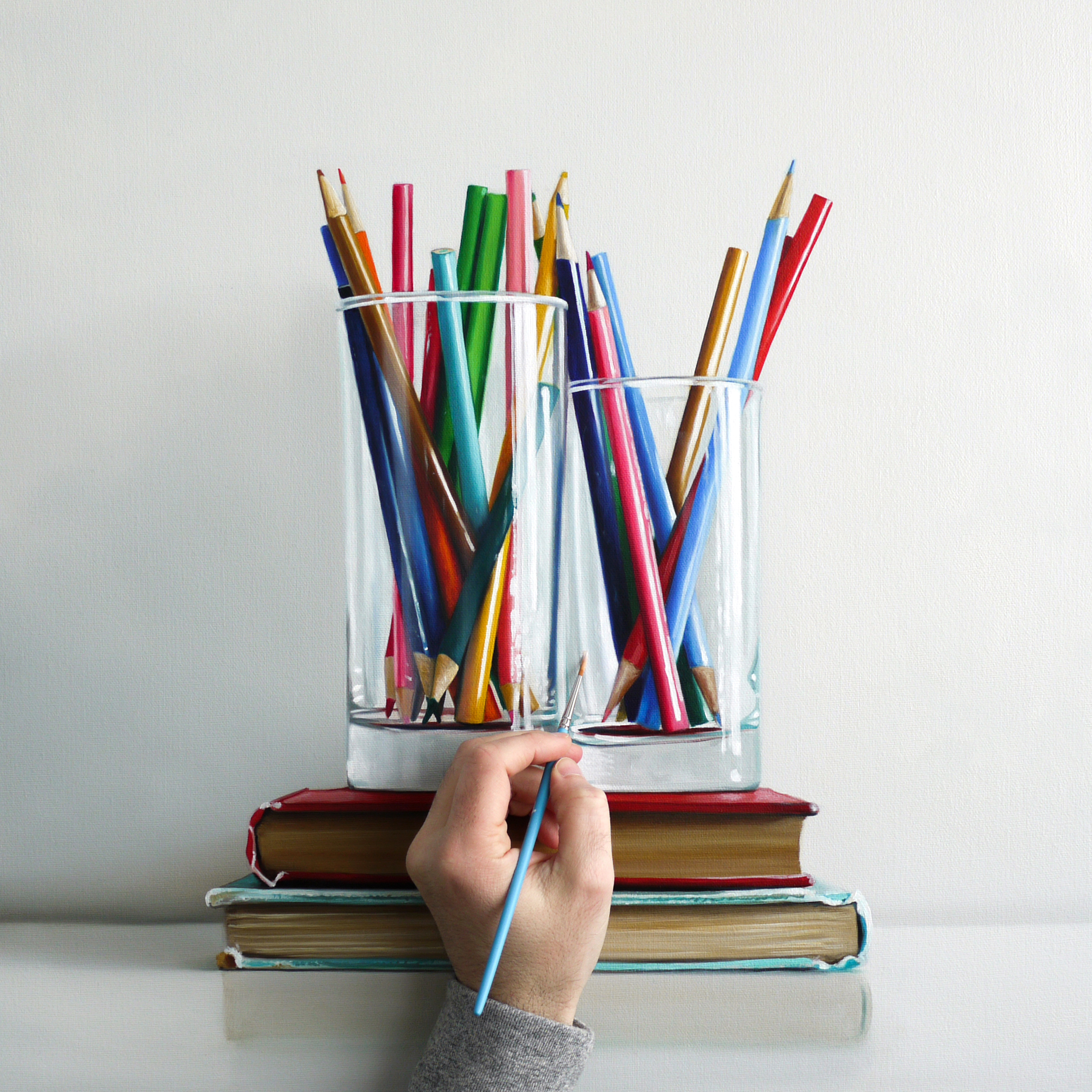
And there, just like that the final touch and this one is done. Now it will dry, then a coat of varnish to make the colors pop before it’s off to New York to debut on the gallery wall under a well placed light.

And there, just like that the final touch and this one is done. Now it will dry, then a coat of varnish to make the colors pop before it’s off to New York to debut on the gallery wall under a well placed light.
I have been keeping a journal for 26 years. Something I notice when I read back to see what was going on in my life, say 10 years ago, is that there’s a definite cycle, a pattern of behaviours and moods. February always stands out. There is a way for me to combat the February doldrums — by occupying myself with deadlines. So for the last several months, I have been working toward a late March exhibition in New York. Too occupied to fuss around on social media. And that is a good thing.
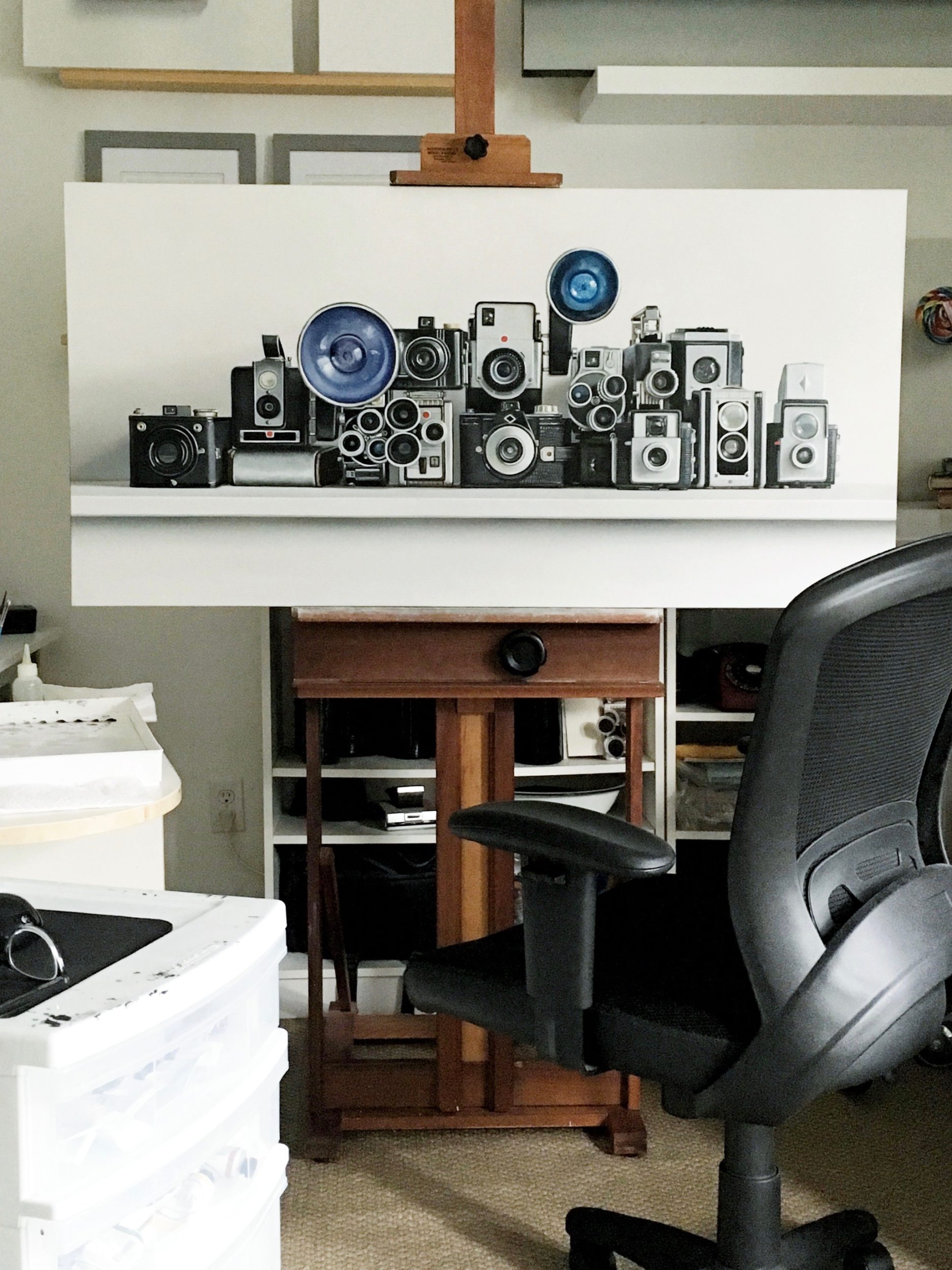
I have begun working on the last two paintings for the exhibition and it feels good. Once they are complete, I move into packing and shipping. The shipping part is the most anxiety-riddled process as I hand over my life’s work to companies whom I trust to get everything across the continent intact and on time.
January 5 was a momentous day for my family. My Grandfather, James William Stott, died at 96.
My brother, sister and I have been talking over these last few days about him. There’s a connection we have with him that is unique and special.
In 1968, long before my sister and brother and I were born, long before my parents were together, there was a terrible incident on a warm October evening in the small town of Midale, Saskatchewan. My other grandfather, Eric, was found unresponsive in his home. He had finally succumbed to complications with his heart after it was weakened by rheumatic fever decades earlier when he was a child.
A panicked call went out, an ambulance was called but would take time to reach the small town. In desperation, my mother’s mother ran to their neighbours and friends for help. I can’t imagine the scene, it breaks my heart. My mother was just a young teenager, her brothers 10 and 4 years old. Their father slipping away. My father’s father ran to help — in vain he performed CPR. Eric died that day, and my parents families were forever linked with a unique bond.
Decades later I would find myself visiting my grandparents and walking around the little town with my own children — our personal family history surrounding us in a few square blocks, almost unknown and forgotten.
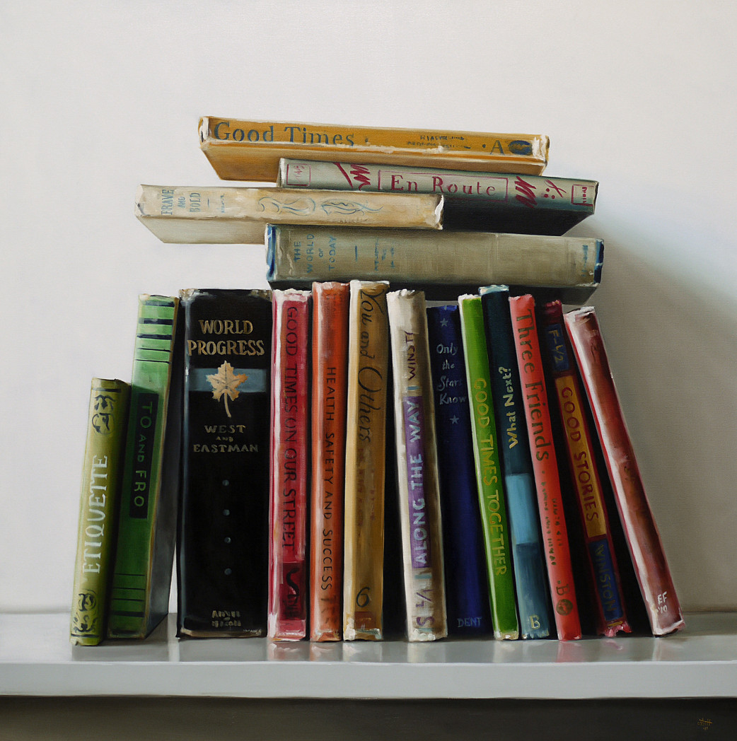
43 years after my Grandfather Jim tried to save my other Grandfather Eric’s life, I would stumble upon a room in a heritage building opened for a festival. A schoolhouse about one block away from where my mother and father grew up. I found stacks of books in a classroom frozen in time. I have used these books and memories as inspiration and direction for my work and will continue for years to come.
My grandfather had a difficult beginning to his long, long life. In 1932 his mother died young, his father left for the coast to find work. At 10 years old, he was left in the care of neighbours. Essentially an orphan during the roughest economic times in the past century. It’s amazing that he was able to carve out a full life after a precarious start, but I think we owe this to his remarkable wife, Kay. They were together for 73 years.
We should all be so lucky. To spend seven decades of your life with someone who respected and cared for you as much as these two did for one another. Although the last few years have been incredibly difficult, we can now focus and remember the good times. It’s what Grandpa Jim would have wanted.
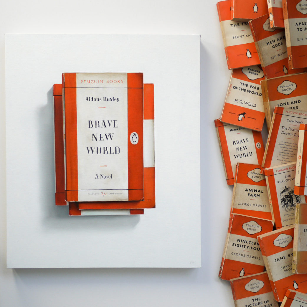
I read this book 17 years ago – long before social media. How is it possible that things might be turning out worse than the fiction of the book? Perhaps we shouldn’t think about this too deeply and just find a funny and cute YouTube video to take our minds off things.
This Penguin Books classic edition of Aldous Huxley’s Brave New World is the perfect subject on many levels. Not only is the theme of the book relevant, but the simple graphic design of the cover with the symmetry and balance attracts me as well.
Happy New Year! Let’s make it a good one.
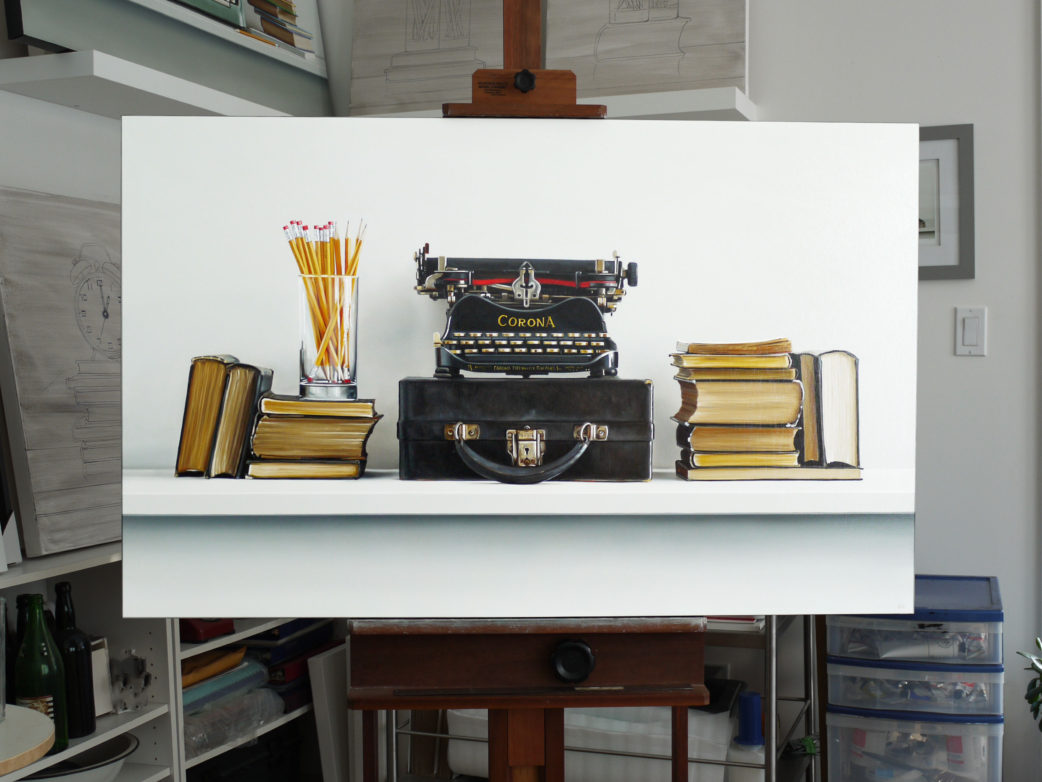
Here’s a glimpse of a recently completed painting – a Corona No.3 typewriter. I’ve used this in the past but it needed a bit more of a grand composition so I added some pencils and books.
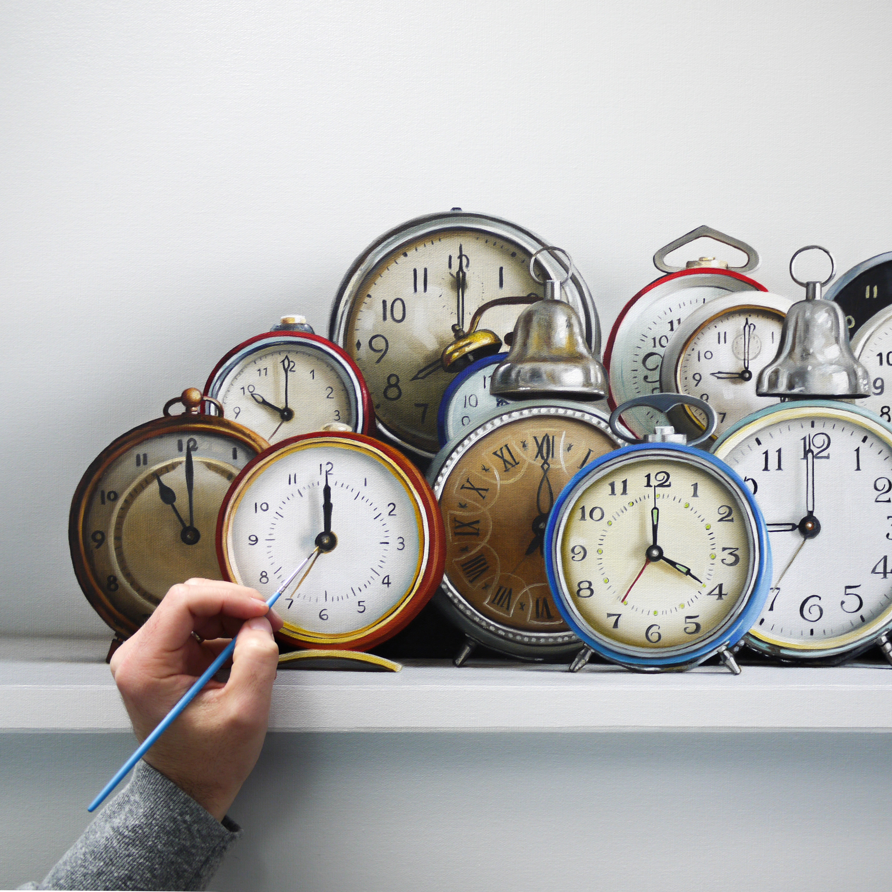
I’ll be calling this one “All the Time in the World”. It’s a bit challenging but that’s a good thing. Clocks are a subject I’ve worked with over and over again for many years. Rife with symbolism and ideas – it’s an ongoing process to perfect technique. Layers of paint over several days, I keep entering the studio throughout different times of the day and seeing areas that need reworking.
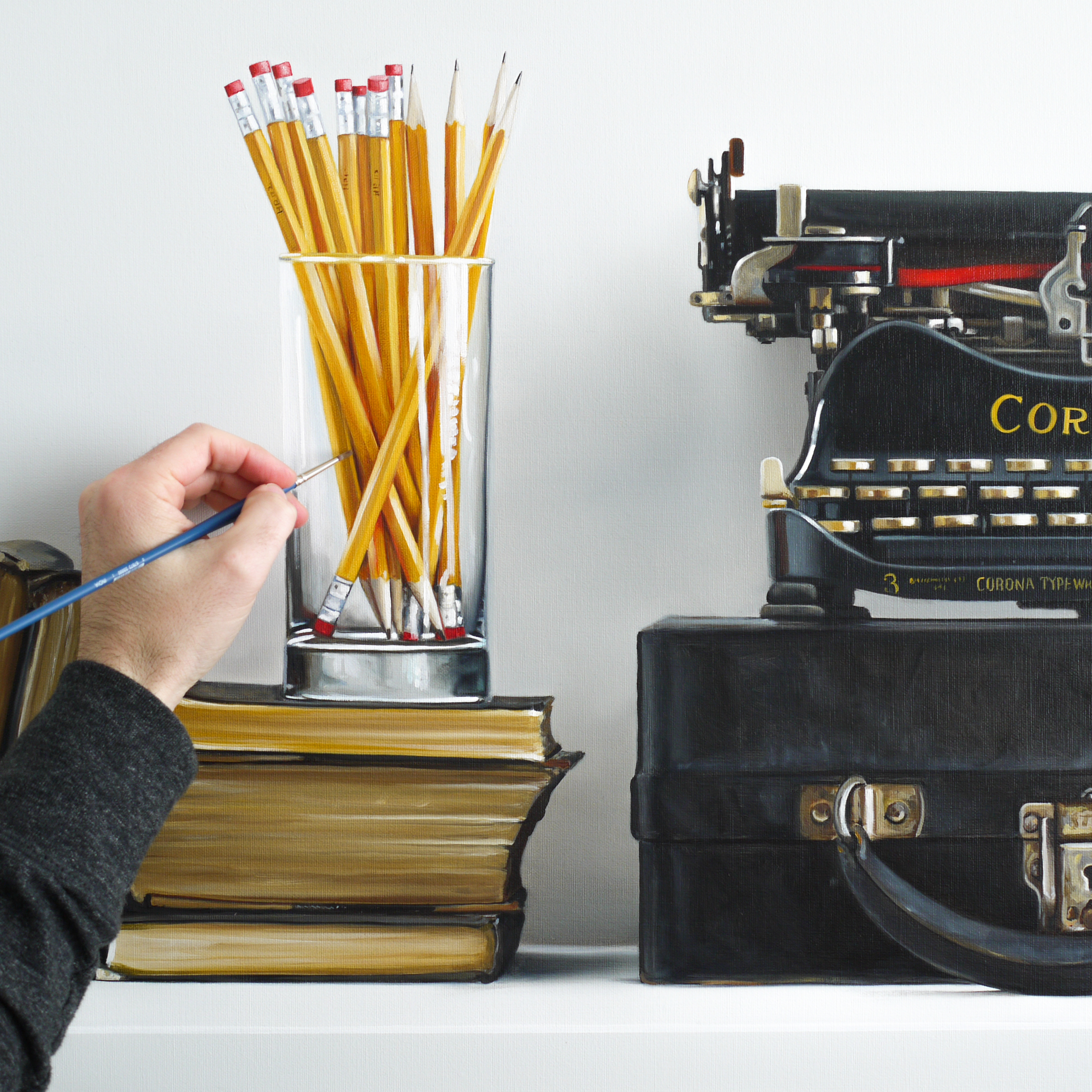
A new piece, almost complete. It’ll be featured in my March 26 – April 27, 2019 exhibition that will be very heavily on my mind for the next several months.
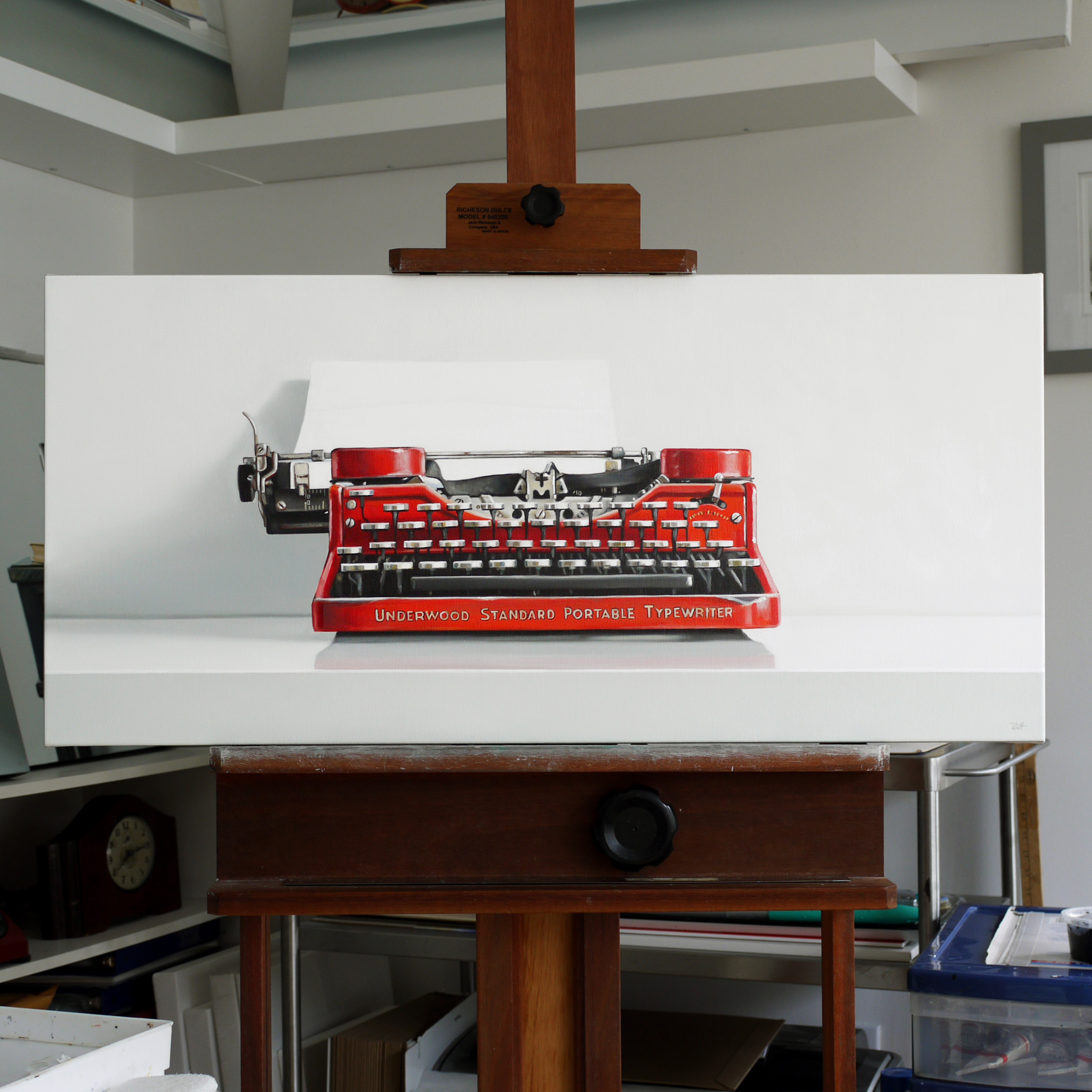
I just finished this commission and now I can start focussing on new paintings for my early spring 2019 solo exhibition in New York City at the George Billis Gallery.
For the third year in a row ITOYA has issued a calendar featuring a dozen of my paintings. The calendar is made exclusively for the Japanese market, and ITOYA is in charge of all the sales.
The calendar is large, measuring at 23.5″ x 16.5″ and printed on sturdy, heavy weight paper, the images are big and colorful.
If you’re outside of Japan, try using tenso.com to import the calendar. You can find the calendar on the ITOYA website here.